


Chill crispy snack -Packaging
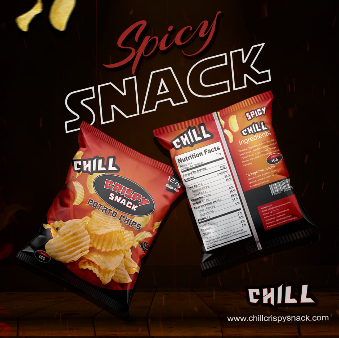
Packaging design for a chips Brand




Objective:
The main objectives for the packaging redesign were to:
Appeal to a younger, social media-savvy demographic.
Create a fun and attention-grabbing packaging design that stands out on store shelves.
Emphasize the high-quality nature of the chips while keeping the design vibrant, energetic, and youthful.
Ensure the packaging is Instagram-worthy and shareable, encouraging users to post about it online.
Challenges:
Appealing to Young Consumers: The design needed to feel modern, energetic, and aligned with the playful spirit of younger buyers.
Brand Differentiation: With many snack brands on the market, it was crucial to create a design that would capture attention and differentiate the brand from others.
Highlighting Quality: While focusing on fun, it was important to make sure the packaging communicated the premium, high-quality nature of the chips without being too serious or formal.
Shelf Visibility: The design had to ensure that the chips would stand out on crowded retail shelves, with vibrant colors and bold visual cues.


